The Blog of Rising and Falling News

Here is the opening to the interactive cover

Here is the opening to the interactive cover

Welcome!

Today I woke up and to my surprise there was almost no jobs out on craigs list, monster, or career builder.  I re applied to one company editing my cover letter and showing that I had a portfolio online.  Hopefully I will hear back from companies soon.  After I went to the gym to work out and keep getting strong for lacrosse season next week.  After the gym I was home eating when the doctor called to tell me that I have had mono for the past month.  No good, apparently what I thought to be tired because of the end of the semester turned out to be mono.  After that we went to the grocery store for a few groceries and picked up my youngest sister at school.  Came home and I left to go play lacrosse.  Mono, I mean why not my spleen hasn’t broken yet I should just keep pushing it.  Laxing was good a lot of passing and some shooting.  After I came home to work on the car.  I finally got the gas siphoned out of the car.  Dinner was recooked steak and after dinner I am here.  I worked hard today for all of you to make a real nice design discussion, but thats all I did today, I know people aren’t reading for this.

Ok, lets get to some graphic designing.  Again I got this piece from Computer Arts.  If you enjoy design and aren’t reading this magazine, you need to; and if you like design and don’t like this magazine, what’s your problem?  I found a piece that Computer Arts said is promising in interaction, and if any of you know me when I hear the word interaction or interactive I foam at the mouth.  The piece called “The Story of Rise and Fall” was created by Nexus Productions directors Theo Watson and Emily Gobeille.  Waston has been shown at Moma, The Sundance Film Festival, and the Museum N8 Amsterdam.  Recently Watson received  the 2010 Designer of the Year Award in the Interactive Category and the Future Everything award.  Gobeille has less of her past online but she has many pieces of work on her website.  Expect future blogs to be analyzing both of these designers.  Currently both Watson and Gobeille work together for Nexus Productions creating an amazing interactive team.

Recently, Boards Magazine contacted Watson and Gobeille to create an interactive magazine cover.  The two together created this amazing interactive piece.  To view the works behind the piece go to this link, go to “The Story of Rise and Fall” and watch the videos.  If you purchase the magazine, which I have not done, go to this link; and watch the piece.  I have only watched the videos but I really enjoy the design alone, the interactivity is something else.  Lets look at some real pictures!

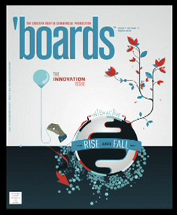
Here is the cover to Boards Magazine

Here is the cover to the piece designed to create the interactive piece.  I personally am unsure but I think the design works with the small white chip on the lower left corner.  I like how the cover shows both the rise and fall.  This is fun.   The entire piece is great design.  Next picture will be the difference of rise and fall in detail!

The seperation between the RISE and FALL!

The seperation between the RISE and FALL!

I enjoy the rise background color.  We have a bright light blue which has a nice background texture.  The fall has a dark background that just fades into the rest of the image.  The rise has textures of the fall in it with the blue clouds which are a nice detail.  it seems that the things in the rise interacts with the main character the hand.  The red things fly around with the hand while the fall tries to stay together and engulf the hand.  I hope though that Watson and Gobeille are not saying that an umbrella is a sign of falling or failing because I always think of Travelers which my family get employed by.

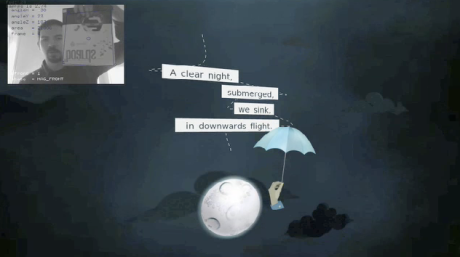
The quotes

Here are quotes that are put up during rise and fall parts

I enjoy the moon being a little distorted and the dotted lines around the text.  The text itself fits in with the piece because it is talking about falling. It also works because of the sans serif fonts.  Makes everything seem slim like it is slowly falling.

Overall this piece is great.  I have not seen the final product but the design and the piece looks great.  The work shows great potential and obvious examples of Nexus.  Tomorrow we will work at more designs.  Have a good night and whatever you do create and be yourself.  Enjoy

Mikemac10

Design, to your prime, and then, design your decline.

happy june!

Today was a day where I created more blocks on the base to my career path.  This morning I woke up and prepared for my day.  Then I worked on the website for a bit and applied for a few more jobs.  Five in total today for applications.  After a few applications I went to the grocery store which was interesting to look at the design of the store and notice they put three pictures of the Enfield area.  This was interesting because three pictures in a corner of an entire supermarket seems underdone.  I came home and ate some pita and after some digestion I went to the gym.  After a week of sickness getting the body back into shape was good.  I came home relaxed for a bit, had dinner, then went to get a pipe to siphon the gas out of the van.  After a lot work, we finally got the pump to work.  Now I watched television and should be going to bed soon.  Tomorrow I’m waking up, going to the gym, and then living for the day.  Look a few places for a job and hope for something to come.

Lets get to some business, as no one is reading for my own life.  A lot of these blog postings will be from Computer Arts magazine.  I am a huge fan and I want everyone to know about them.  They have a section every month of up and coming designers. I’m sure that while blogging about them is not much of a help to their progression of success any reporting is reporting for them.  Anyway, today I want to report on two female designers Rebecca Bolton and Louise Chapell.  The two met in college at the Glasgow School of Art.  They kicked it off and after college started their own design firm called The Goodwives and Warriors. Their style is crazy fun and its very abstract. A lot of illustrators are using the drawing tablets to escalate their work from strict pen tool to free flowing art. They have had scads of work in shows in the United States, South America and Europe. Fine accomplishments for them indeed. Now I will go to the photo section of the blog to talk about some of their works.

Splash page on Good Wives and Warriors

Splash page on Good Wives and Warriors

I wanted to make note first off of their splash page. This piece is FUN and lively. Lots of flowers and berries all around the piece. I enjoy how some of the petals on the edge turn to be more like edges of the frame. Their attention to perspectives is also interesting. What i found most interesting is the rollover image they use. The picture portrays the rolled image while before the letters were in white. This is interesting because it brings the words to the foreground but does not take away from the piece on the splash page.

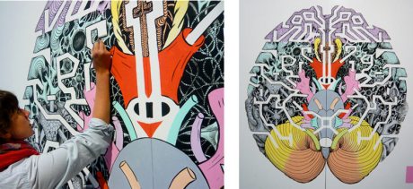
Brains reflected

GWAW'S piece "Decoding" in a display

This is their most recent post on their website.  The piece is in Breda, Holland, and is on display starting in May 2010.  I like this piece and feel like this could also be the discription of these two women.  The same brains, connected together.  It is a great piece and I particularly enjoy the reflection they did.  The color scheme is great with a pink flesh tone, a almost green teal, a yellow and orange.  This is a lot of fun to watch.

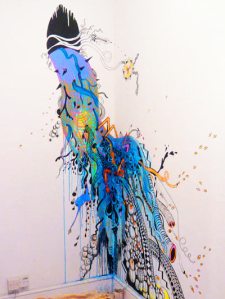
"Lunita" by GWAW

This is a piece from GWAW called "Lunita"

This piece is a great work.  I envy this piece because I have always wanted to work on a wall piece but never got to during my time at college.  This piece to me looks like the wall has broken a gasket and has spewed everything that it had behind it.  I like how the top pieces are actually still in black and white like they have not come out with all they have behind them.  This piece has life to it and full of potential.  I have to say go after them girls!  Take the world by storm!  Which is something that they have done all right.  Not only have they hit the pages of Computer Arts, but their clients are none short of MTV, A.D.I.D.A.S., Swatch, Wired Magazine, and Urban Outfitters.  But Good Wives and Warriors seem to be modest in their approach, acting the part of N.B.D.(no big deal) for these great companies.  Please go onto their website and absorb the works of these two well established women.

I am not going to bed.  Tomorrow as said before I will continue to apply for jobs and possibly go outside and catch some fresh air at the gym and such.  Keep designing and we will see you back here tomorrow.  Good evening!